Student Financial Aid Portal

Student Financial Aid Portal

Student Financial Aid Portal

Simplifying Financial Aid for a Seamless Student Experience

Simplifying Financial Aid for a Seamless Student Experience

Mar 4, 2024

SOFTWARE

Figma

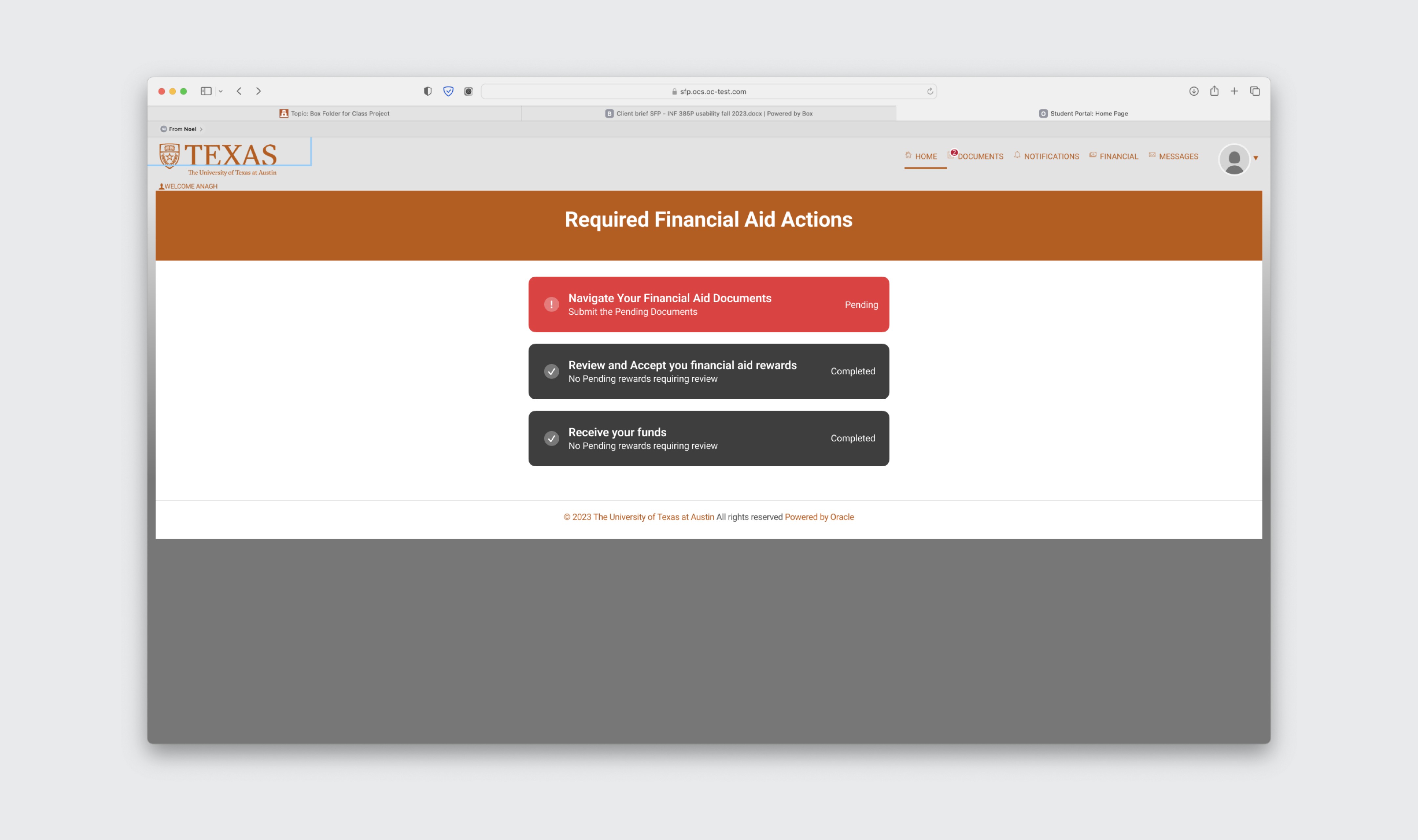
This case study explores the transformation of the Student Financial Aid Portal (SFP) at the University of Texas at Austin, conducted in collaboration with Oracle. Our project aimed to replace the outdated CASH portal with a modern, user-friendly interface that improves communication, enhances user experience, and streamlines financial aid processes. Through comprehensive research and user testing, we identified key pain points and implemented targeted solutions to create a seamless and intuitive financial aid experience for all students.

Introduction

The University of Texas at Austin, in collaboration with Oracle, embarked on a mission to revolutionize its academic information system.

The goal was to replace the outdated CASH portal with a new, user-friendly Student Financial Aid Portal (SFP). This case study narrates our journey to enhance the SFP, focusing on improving user experience, streamlining processes, and ensuring effective communication.

The Challenge

The existing CASH portal presented numerous challenges for students. Complex navigation, unclear instructions, and a lack of transparency in financial aid processes were major pain points. Our task was to create a seamless, intuitive, and comprehensive portal that would address these issues.

The Objectives

  1. Improve Communication: Ensure transparency and clarity in financial aid information.

  2. Enhance User Experience: Simplify navigation and interface design.

  3. Create a One-Stop Solution: Integrate all financial aid processes in one place.

  4. Reduce Customer Support Queries: Provide self-service options to minimize support requests.

  5. Increase Completion Rates: Streamline the application process to encourage timely completion.

  6. Ensure Data Security and Privacy: Protect sensitive student information.

  7. Automate the Aid Process: Reduce manual intervention and streamline workflows.

Rearch Overview

Understanding the Users

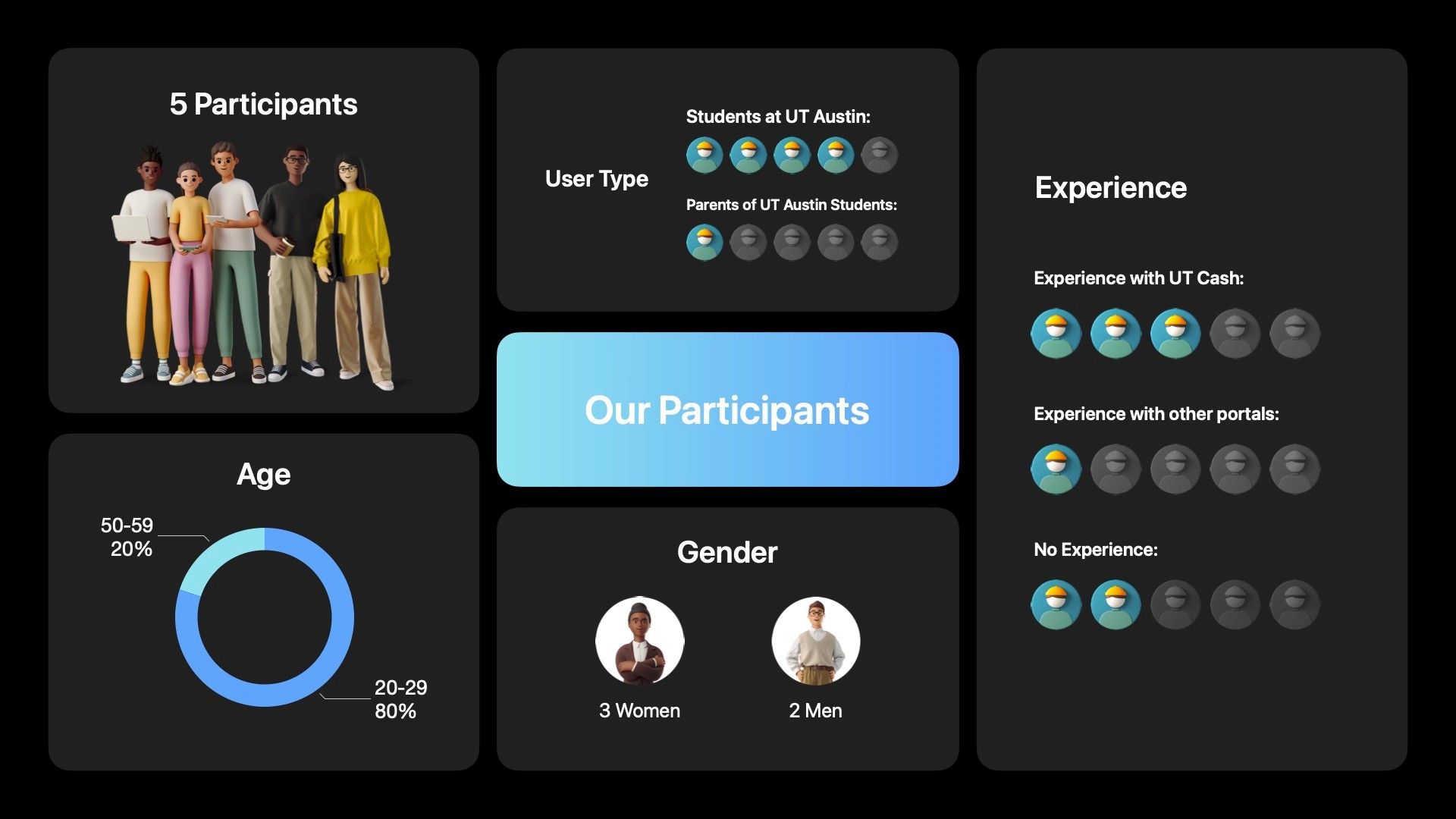
To design a user-centric portal, we needed to understand the users deeply. We conducted usability testing with five diverse participants, including three women and two men, aged between 20-59, all of whom were students at UT Austin.

Their experiences ranged from no experience with financial aid portals to extensive familiarity with multiple systems.

Research Questions

We framed our research around key questions:

  1. Content: Is the platform transparent about financial aid terms and conditions?

  2. Design/Layout: Do users encounter difficulties with form fields, input validation, or error messages?

  3. Navigation: Can users navigate between different sections without confusion?

  4. Terminology: Do users understand the financial aid process and associated terms?

  5. Input: Can users easily submit required documents for aid verification?

The Research Design

We designed our research to include five participants (three women and two men) from UT Austin, aged 20-59. These participants had varying levels of experience with financial aid portals. Our methodology included pretest questions, task-based usability testing using the think-aloud method, and post-test surveys.
Data Analysis

We compiled detailed notes from moderators and note-takers into a structured Excel dataset, forming the foundation of our analysis.

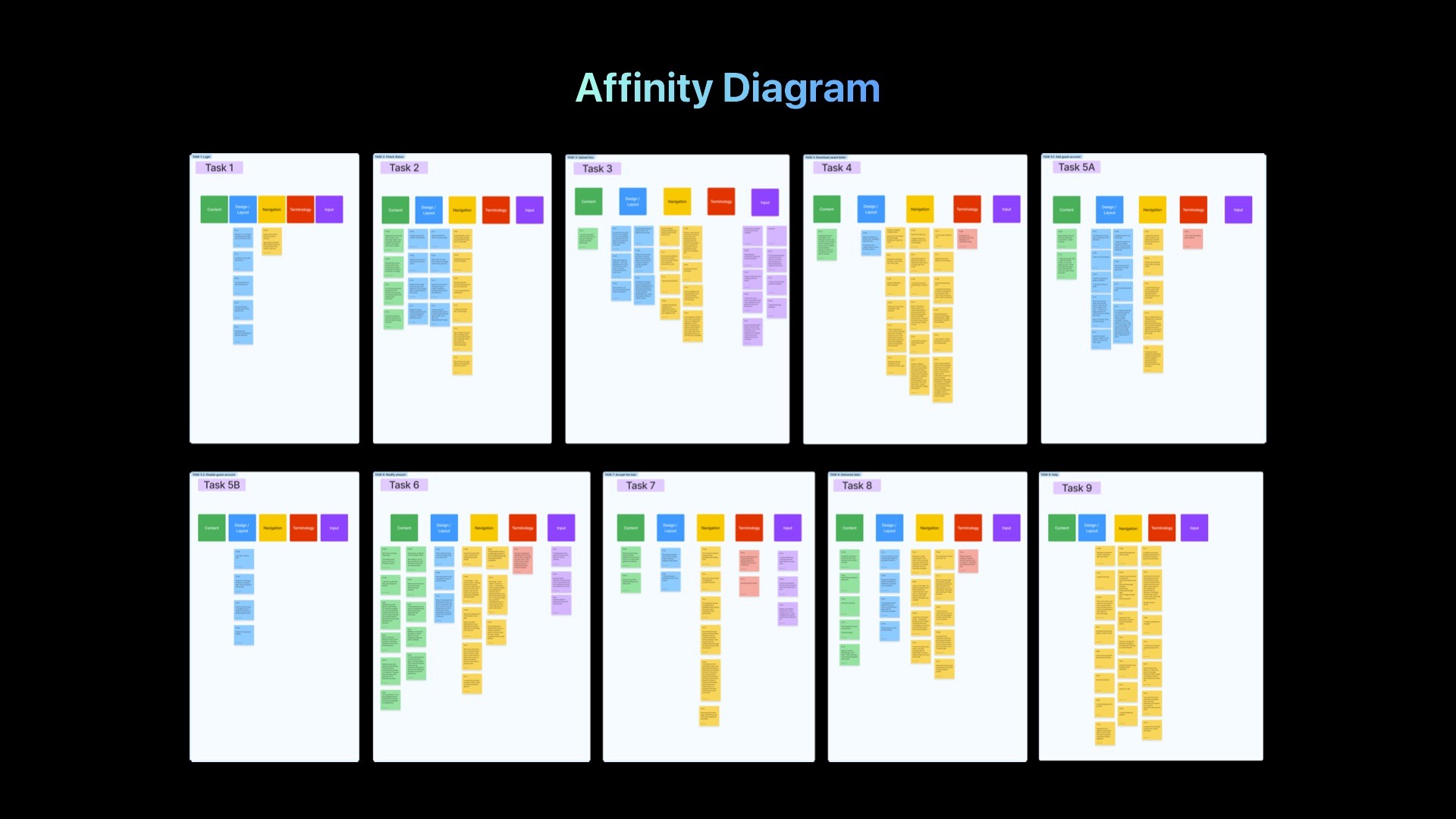
  • Affinity Diagram Development in FigJam: Categorized tasks to uncover patterns and similarities, each task color-coded according to its alignment with specific user goals.

  • Quantitative Insight Extraction: Analyzed Likert scales and SUS scores to extract valuable quantitative insights.

  • Solution Ideation and Feedback-Driven Recommendations: Brainstormed potential solutions and formulated targeted recommendations based on consistent patterns in participant feedback.
Task Analysis

Task 1: Logging In
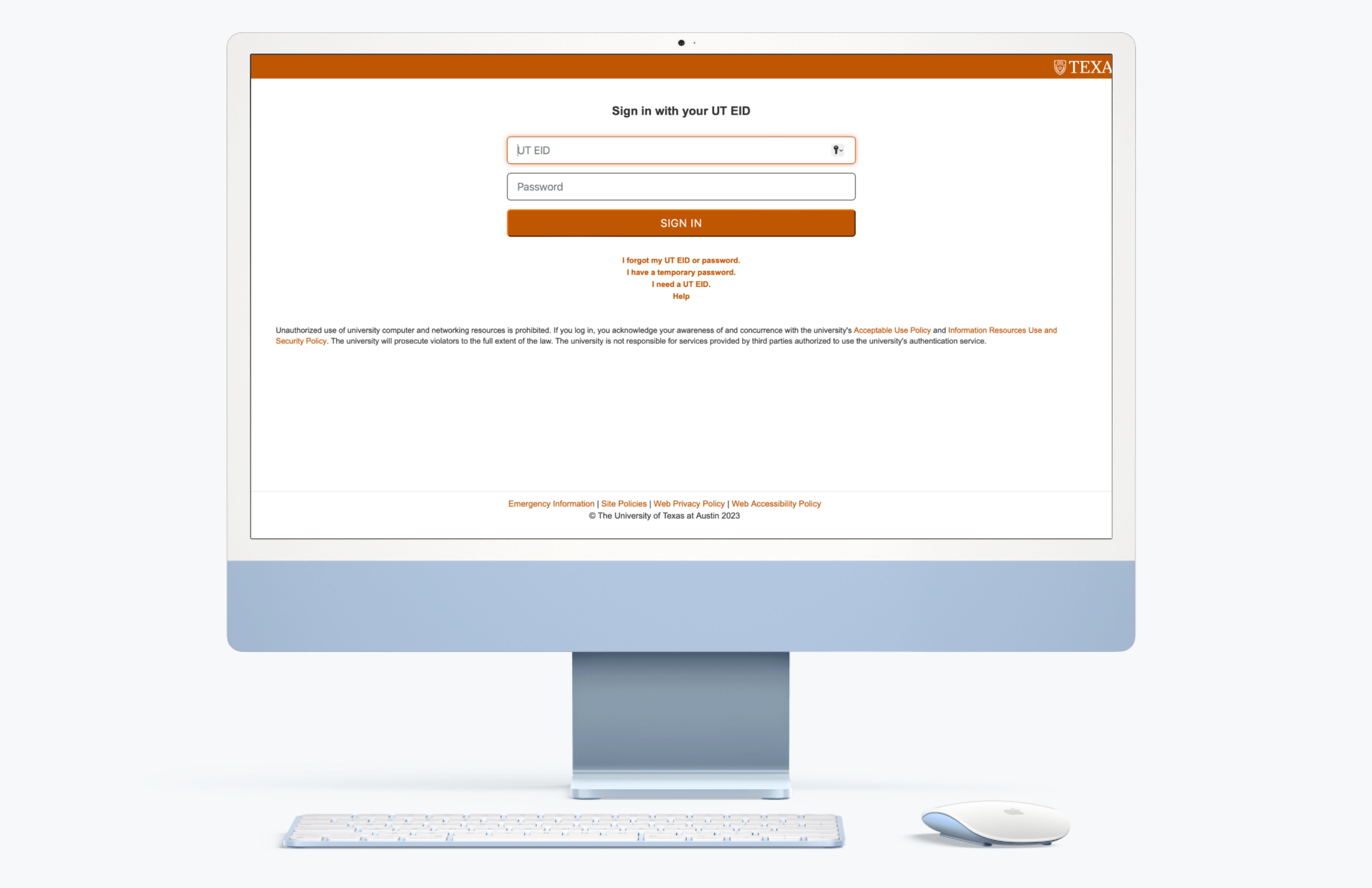
Scenario: Users logged into the portal with provided credentials.

  • Success Rate: 100%

  • Findings: Users were familiar with the interface.

  • Decision: Maintain the current login interface since it works well for users.

Scenario: Users logged into the portal with provided credentials.

  • Success Rate: 100%

  • Findings: Users were familiar with the interface.

  • Decision: Maintain the current login interface since it works well for users.

Scenario: Users logged into the portal with provided credentials.

  • Success Rate: 100%

  • Findings: Users were familiar with the interface.

  • Decision: Maintain the current login interface since it works well for users.

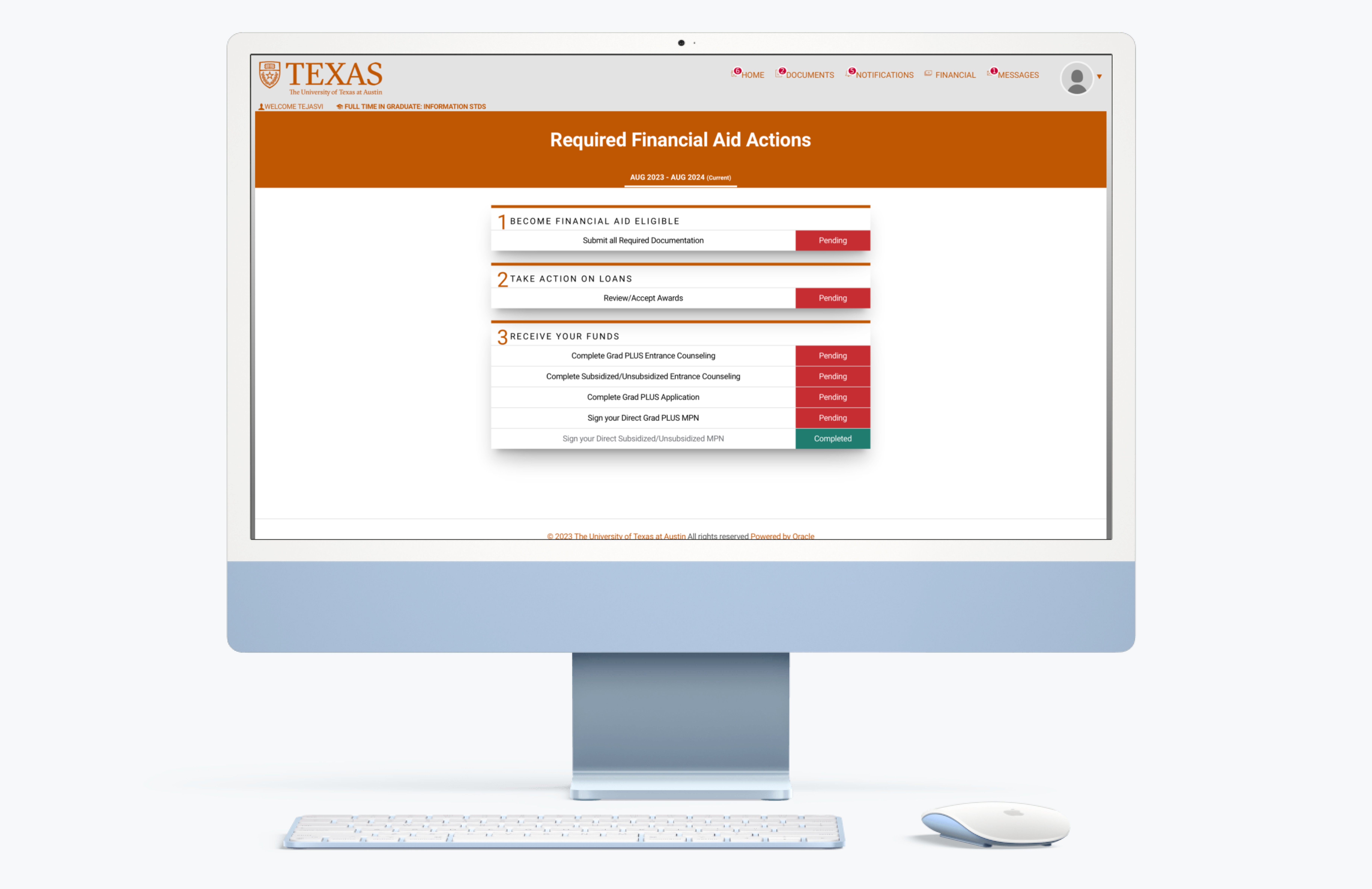
Task 2: Checking Application Status

Scenario: Users checked the status of their GRAD Plus Entrance Counseling.

  • Success Rate: 60%

  • Findings: Users appreciated the status visibility but found the button unclear.

  • Design Recommendation: Improve button visibility to reduce confusion.

Scenario: Users checked the status of their GRAD Plus Entrance Counseling.

  • Success Rate: 60%

  • Findings: Users appreciated the status visibility but found the button unclear.

  • Design Recommendation: Improve button visibility to reduce confusion.

Scenario: Users checked the status of their GRAD Plus Entrance Counseling.

  • Success Rate: 60%

  • Findings: Users appreciated the status visibility but found the button unclear.

  • Design Recommendation: Improve button visibility to reduce confusion.

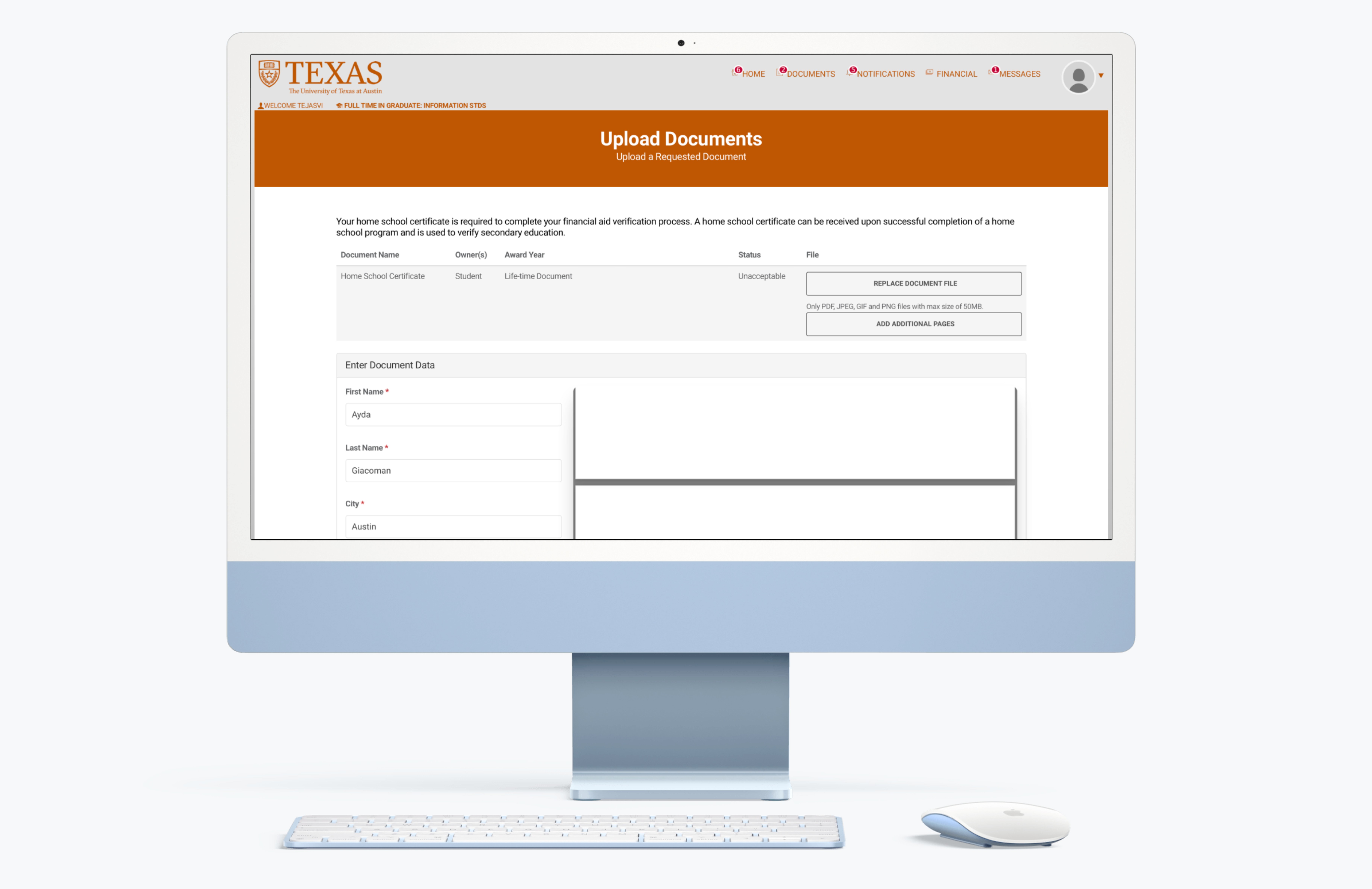
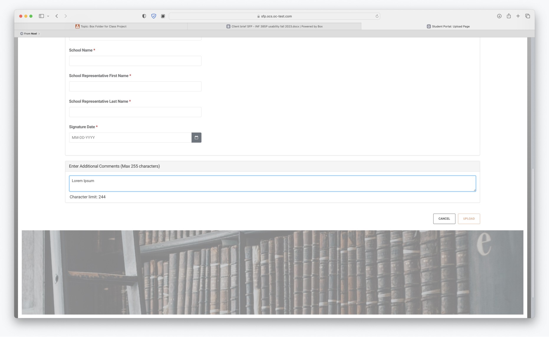
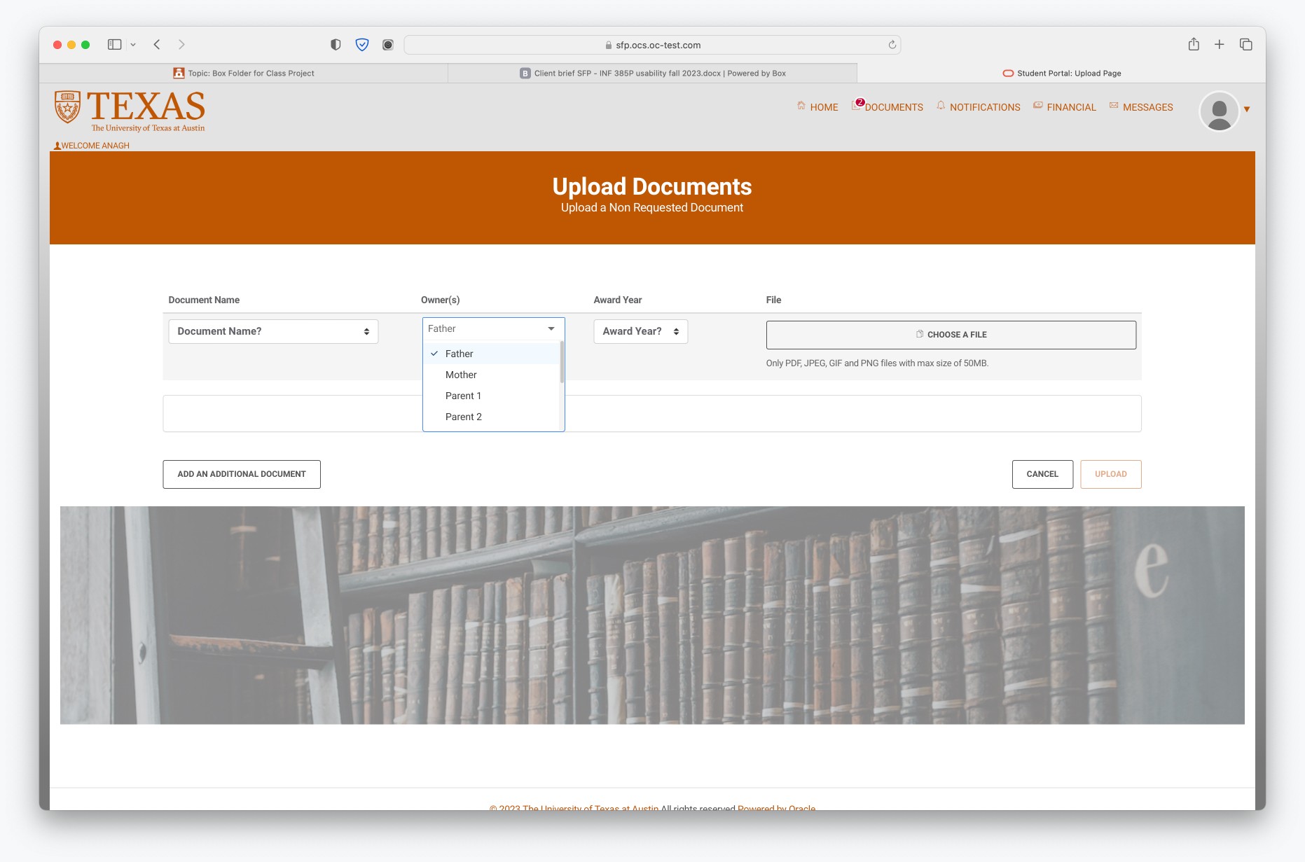
Task 3: Uploading Required Documents

Scenario: Users uploaded a missing document from their computer.

  • Success Rate: 80%

  • Findings: Users struggled to find the “Upload” button.

  • Design Recommendation: Make the “Upload” button more prominent.

Scenario: Users uploaded a missing document from their computer.

  • Success Rate: 80%

  • Findings: Users struggled to find the “Upload” button.

  • Design Recommendation: Make the “Upload” button more prominent.

Scenario: Users uploaded a missing document from their computer.

  • Success Rate: 80%

  • Findings: Users struggled to find the “Upload” button.

  • Design Recommendation: Make the “Upload” button more prominent.

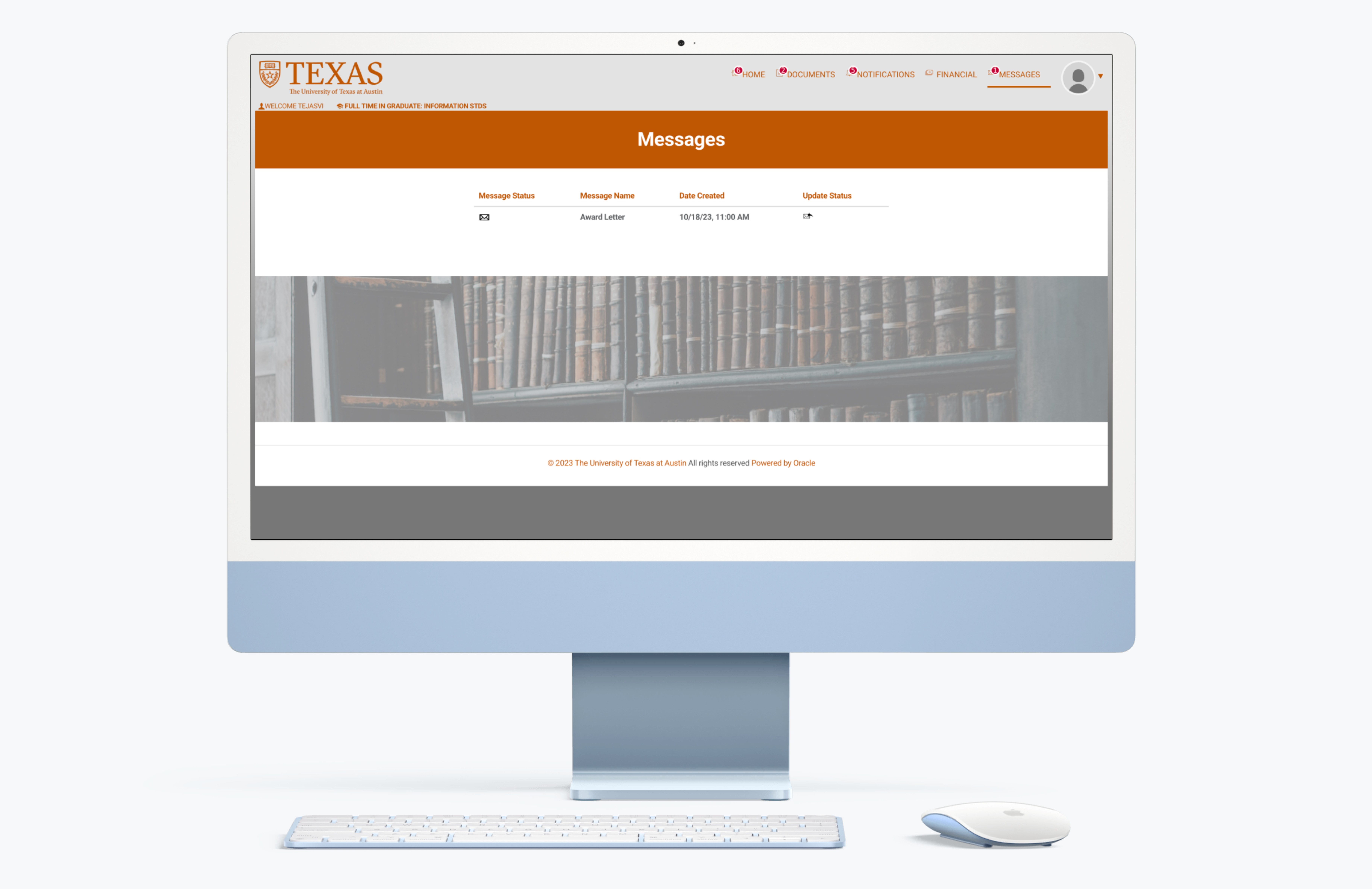
Task 4: View & Download Award Letter

Scenario: Users viewed and downloaded their award letter.

  • Success Rate: 60%

  • Findings: Users had difficulty locating the award letter.

  • Design Recommendation: Place the award letter on the “Financial” page and make the “Messages” page more intuitive.

Scenario: Users viewed and downloaded their award letter.

  • Success Rate: 60%

  • Findings: Users had difficulty locating the award letter.

  • Design Recommendation: Place the award letter on the “Financial” page and make the “Messages” page more intuitive.

Scenario: Users viewed and downloaded their award letter.

  • Success Rate: 60%

  • Findings: Users had difficulty locating the award letter.

  • Design Recommendation: Place the award letter on the “Financial” page and make the “Messages” page more intuitive.

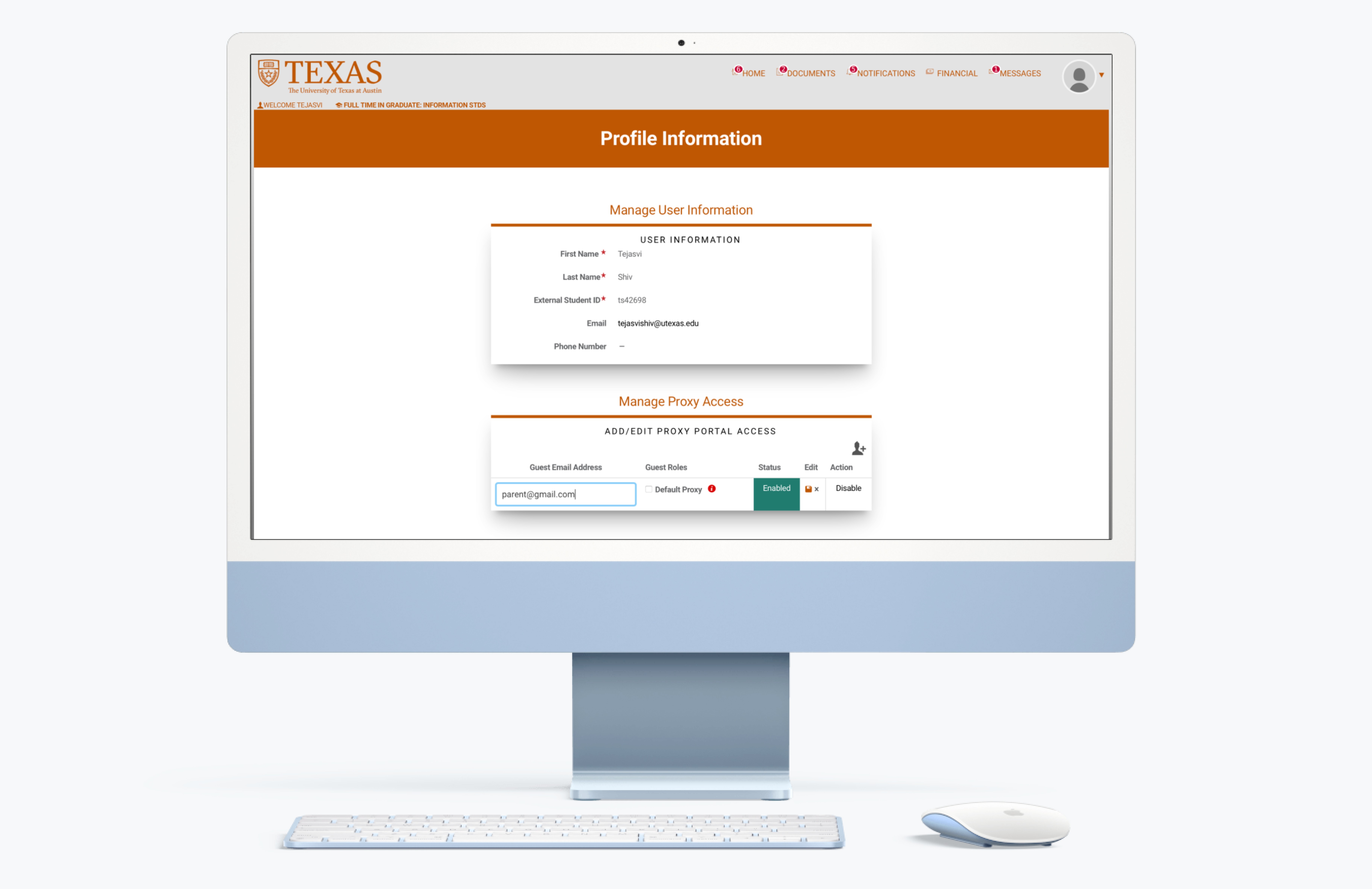
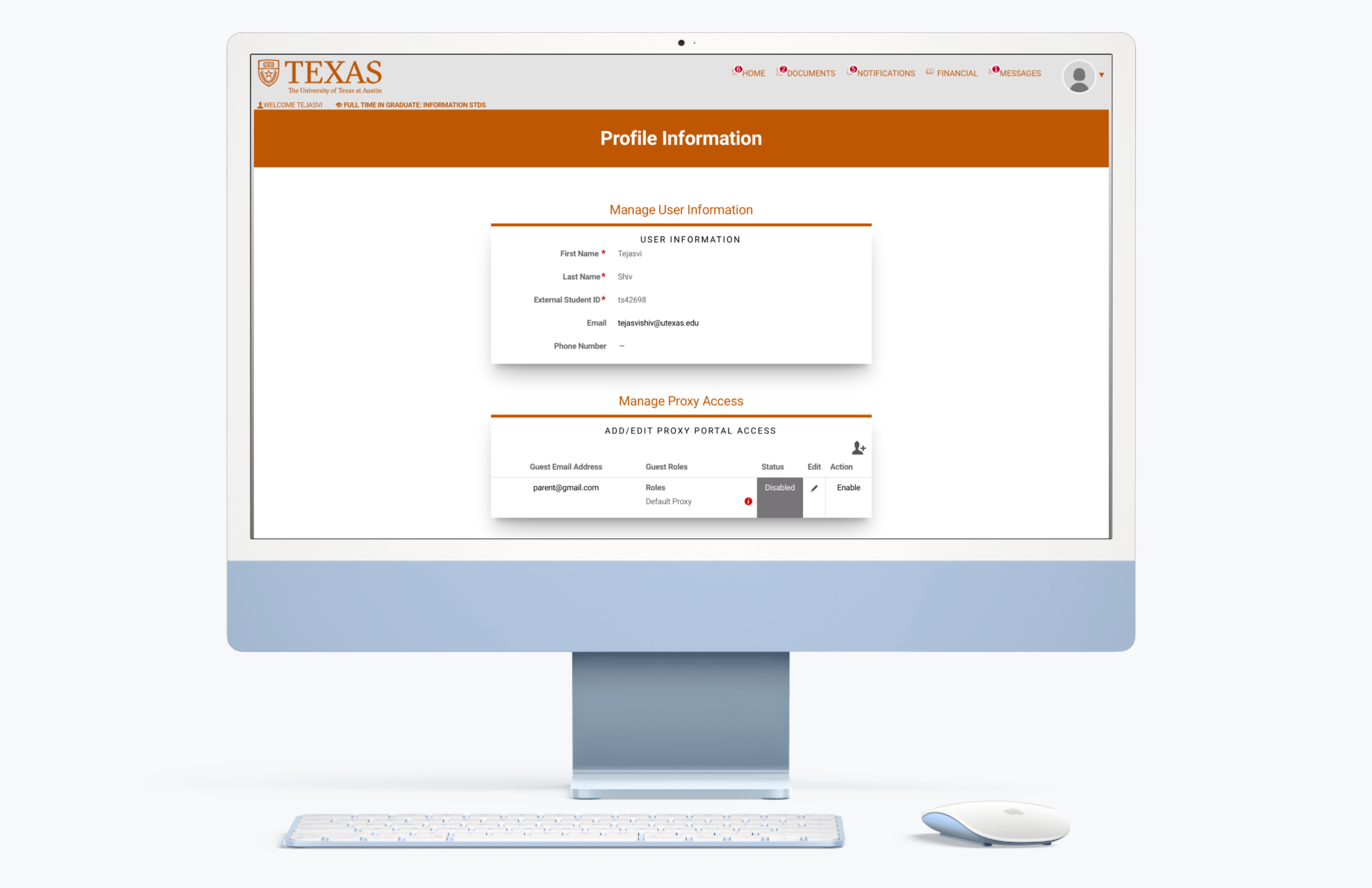
Task 5A: Grant Access to Parents

Scenario: Users granted access to their financial aid information for parents.

  • Success Rate: 25%

  • Findings: Users were confused by the terminology and navigation.

  • Design Recommendation: Rename “Proxy” to “Guest,” and make the “Save” button more noticeable and distinct from the “Remove” button.

Task 5B: Revoke Access from Parents

Scenario: Users revoked access to their financial aid information for parents.

  • Success Rate: 33%

  • Findings: Users found the process straightforward but lacked feedback.

  • Design Recommendation: Make the save/delete guest process clearer, providing feedback to indicate current status.

Scenario: Users revoked access to their financial aid information for parents.

  • Success Rate: 33%

  • Findings: Users found the process straightforward but lacked feedback.

  • Design Recommendation: Make the save/delete guest process clearer, providing feedback to indicate current status.

Scenario: Users revoked access to their financial aid information for parents.

  • Success Rate: 33%

  • Findings: Users found the process straightforward but lacked feedback.

  • Design Recommendation: Make the save/delete guest process clearer, providing feedback to indicate current status.

Task 6: Adjusting Award Letter Amount
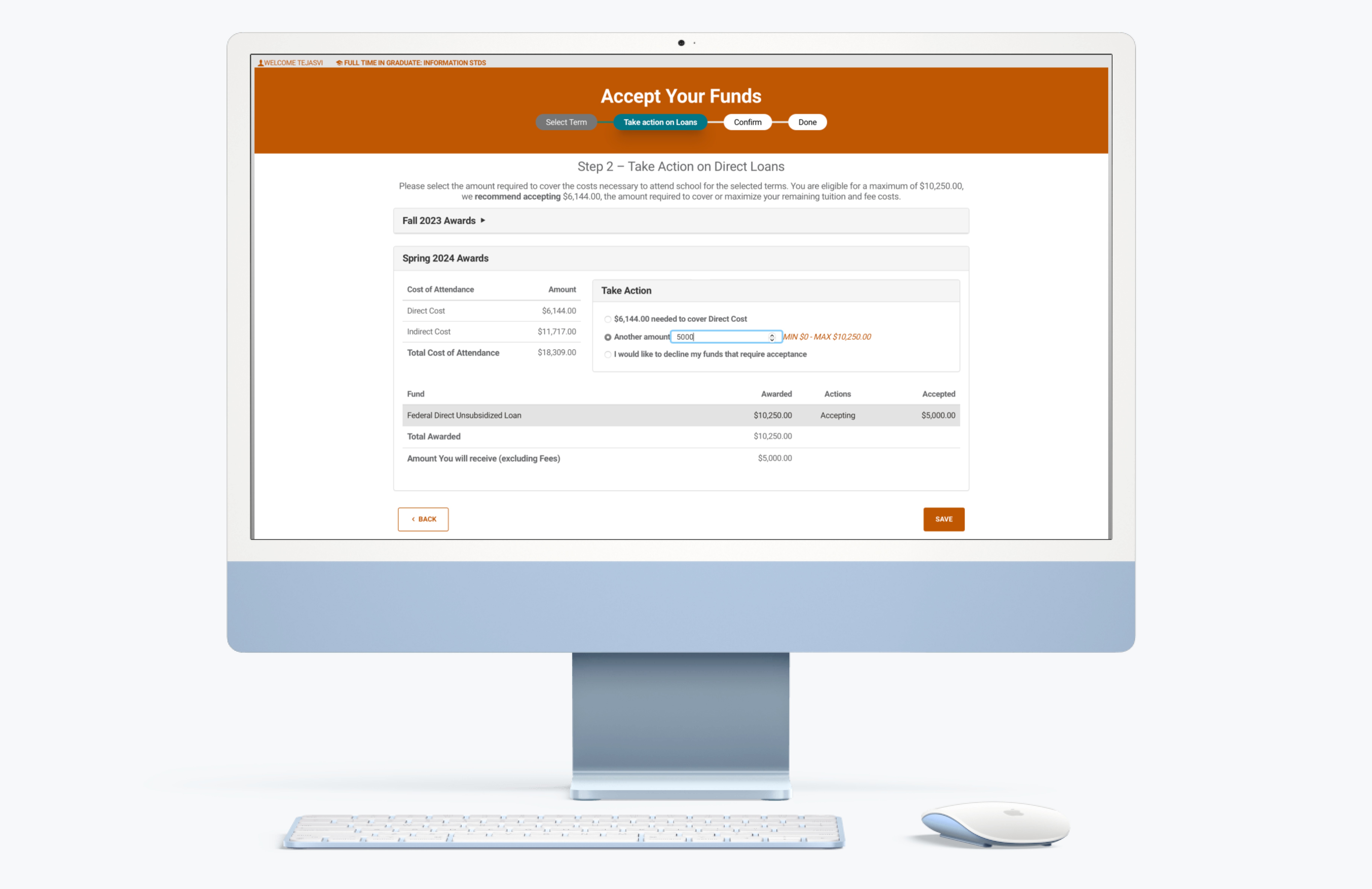
Scenario: Users adjusted their financial aid amounts.

  • Success Rate: 100%

  • Findings: Users were hesitant and confused about which loans they were modifying.

  • Design Recommendation: Highlight the semester selection checkmarks and clarify the loan modification process.

Scenario: Users adjusted their financial aid amounts.

  • Success Rate: 100%

  • Findings: Users were hesitant and confused about which loans they were modifying.

  • Design Recommendation: Highlight the semester selection checkmarks and clarify the loan modification process.

Scenario: Users adjusted their financial aid amounts.

  • Success Rate: 100%

  • Findings: Users were hesitant and confused about which loans they were modifying.

  • Design Recommendation: Highlight the semester selection checkmarks and clarify the loan modification process.

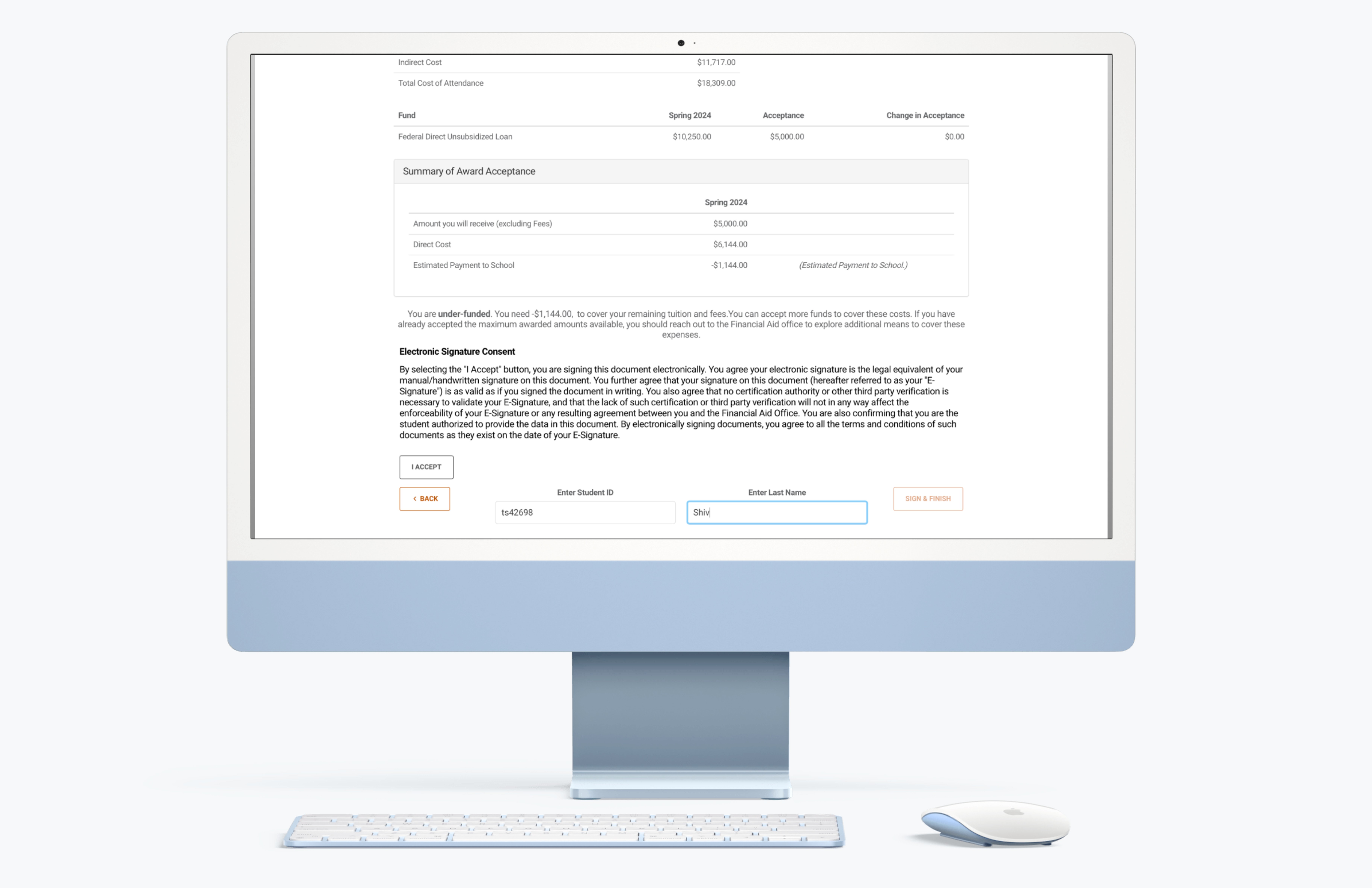
Task 7: Accepting the Award Letter

Scenario: Users accepted their financial aid offers.

  • Success Rate: 100%

  • Findings: Users found the process straightforward.

  • Design Recommendation: Change the “I Accept” button to a checkbox for better clarity.

Scenario: Users accepted their financial aid offers.

  • Success Rate: 100%

  • Findings: Users found the process straightforward.

  • Design Recommendation: Change the “I Accept” button to a checkbox for better clarity.

Scenario: Users accepted their financial aid offers.

  • Success Rate: 100%

  • Findings: Users found the process straightforward.

  • Design Recommendation: Change the “I Accept” button to a checkbox for better clarity.

Task 8: Checking Financial Aid Delivery Dates
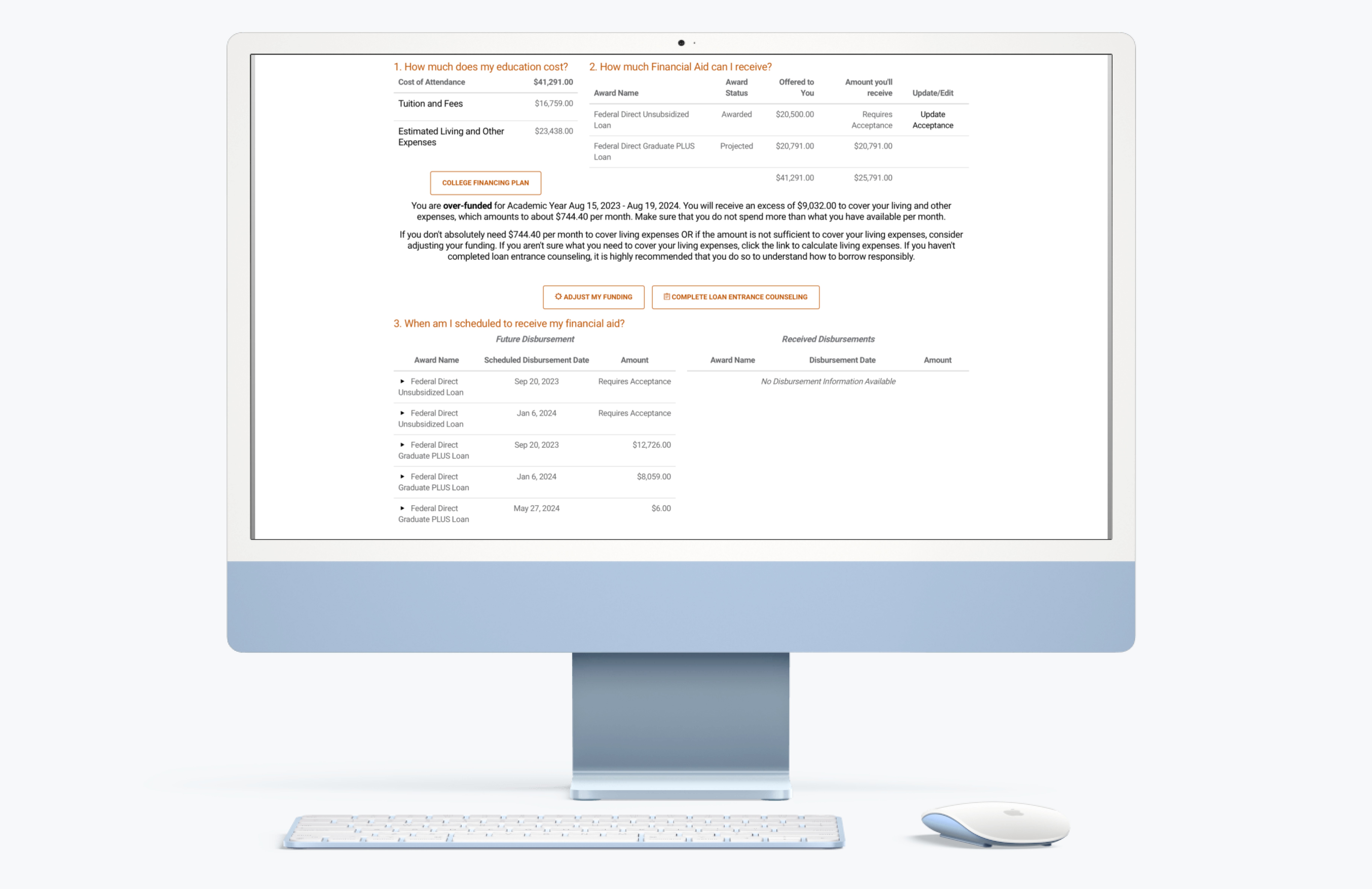
Scenario: Users checked when their financial aid would be delivered.

  • Success Rate: 40%

  • Findings: Users expected to find this information on the Home page.

  • Design Recommendation: Add disbursement dates to the Home page and label them by semester.

Scenario: Users checked when their financial aid would be delivered.

  • Success Rate: 40%

  • Findings: Users expected to find this information on the Home page.

  • Design Recommendation: Add disbursement dates to the Home page and label them by semester.

Scenario: Users checked when their financial aid would be delivered.

  • Success Rate: 40%

  • Findings: Users expected to find this information on the Home page.

  • Design Recommendation: Add disbursement dates to the Home page and label them by semester.

Task 9: Exploring Support and FAQs

Scenario: Users searched for contact information for the financial aid office.

  • Success Rate: 0%

  • Findings: The portal lacked visible contact and support information.

  • Design Recommendation: Add a footer with navigation and contact details, and create a dedicated support and FAQ page.

Scenario: Users searched for contact information for the financial aid office.

  • Success Rate: 0%

  • Findings: The portal lacked visible contact and support information.

  • Design Recommendation: Add a footer with navigation and contact details, and create a dedicated support and FAQ page.

Scenario: Users searched for contact information for the financial aid office.

  • Success Rate: 0%

  • Findings: The portal lacked visible contact and support information.

  • Design Recommendation: Add a footer with navigation and contact details, and create a dedicated support and FAQ page.

Results Analysis

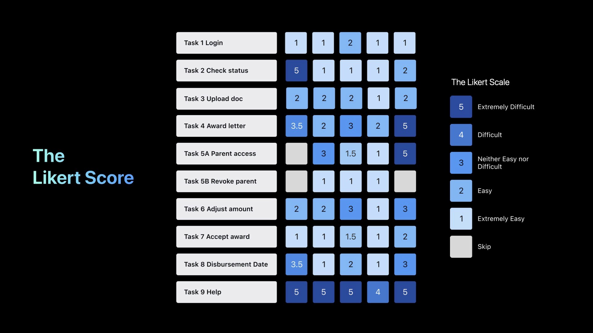
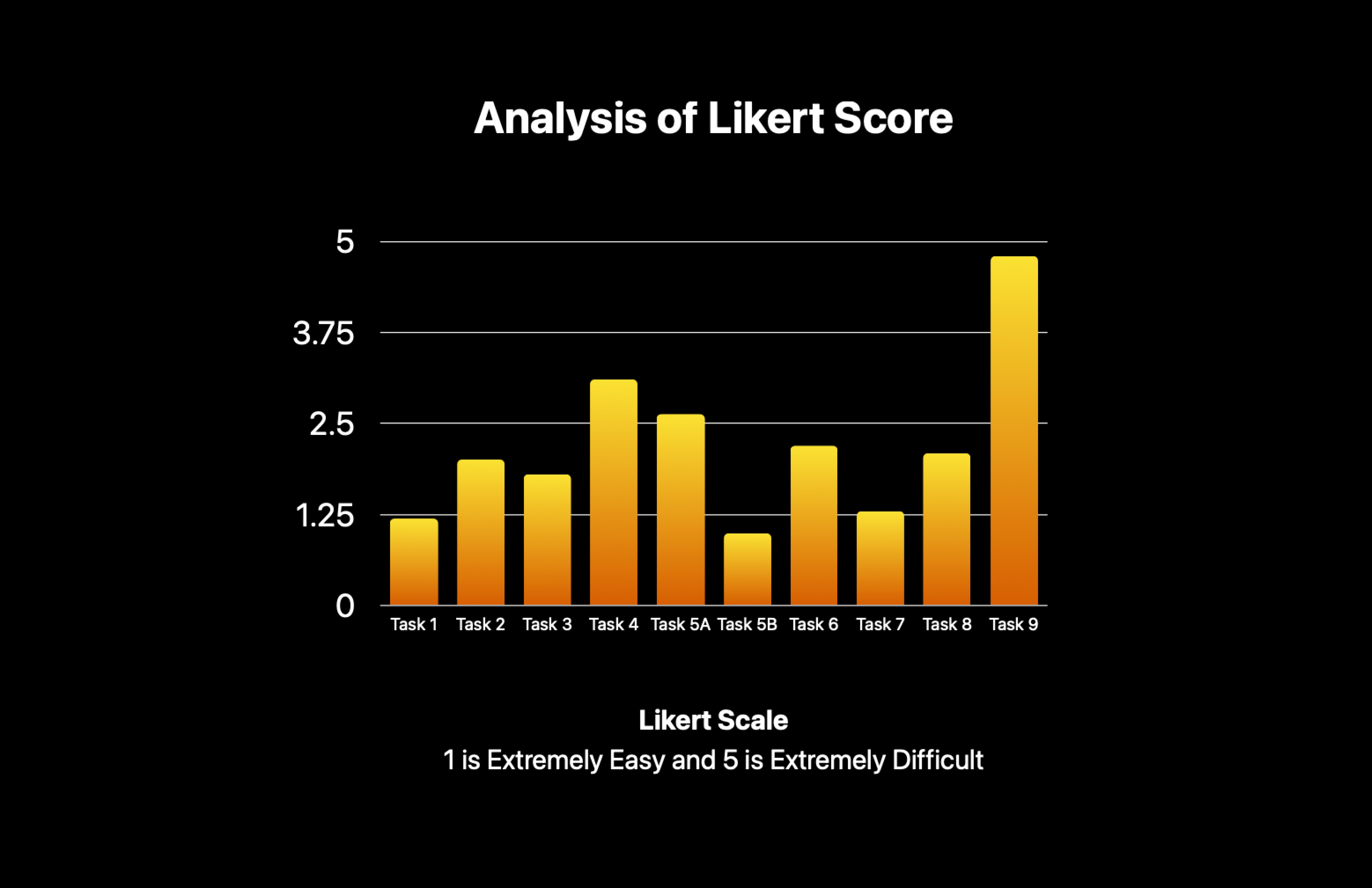
The Likert Score

The majority of Likert scores across ten tasks were below 3.0, suggesting a moderate level of difficulty overall.

  • Most Challenging - Task 9: Consistent with its low success, Task 9 received the lowest scores, highlighting significant challenges.

  • Difficulty Despite Success - Task 6: Despite a 100% success rate, Task 6 was rated as somewhat difficult by participants.

  • Contrasting Indicators - Task 5B: Task 5B’s low Likert score indicated ease, yet it had only a 33.3% success rate, suggesting deeper usability issues.

  • Consistent Findings - Task 4: Task 4's lower Likert score aligned with its difficulty level, mirroring its lower success rate.

The majority of Likert scores across ten tasks were below 3.0, suggesting a moderate level of difficulty overall.Success Rate: 0%

  • Findings: The portal lacked visible contact and support information.

  • Design Recommendation: Add a footer with navigation and contact details, and create a dedicated support and FAQ page.

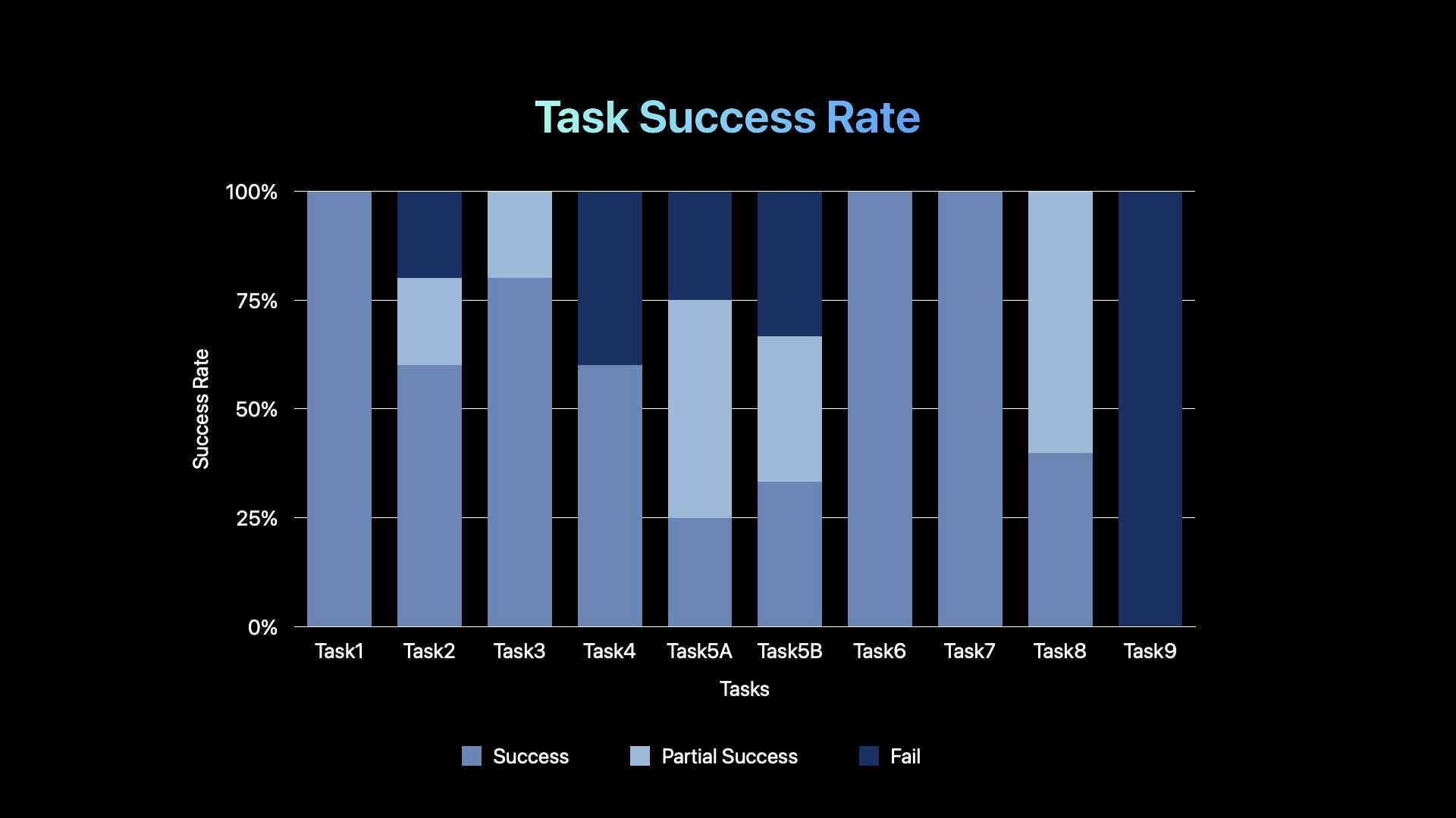
Task Success Rate

Only 3 out of 10 tasks reached a full 100% success rate.

Tasks 4, 5A, and 5B showed significantly lower success rates, highlighting usability issues and necessitating further investigation.

All participants found Task 9 challenging, failing due to inadequate portal information.

Tasks 6, 7, and 8 exhibited increasing success rates, possibly as participants became more familiar with the site through earlier tasks.

The majority of Likert scores across ten tasks were below 3.0, suggesting a moderate level of difficulty overall.Success Rate: 0%

  • Findings: The portal lacked visible contact and support information.

  • Design Recommendation: Add a footer with navigation and contact details, and create a dedicated support and FAQ page.

System Usability Scale (SUS) Analysis

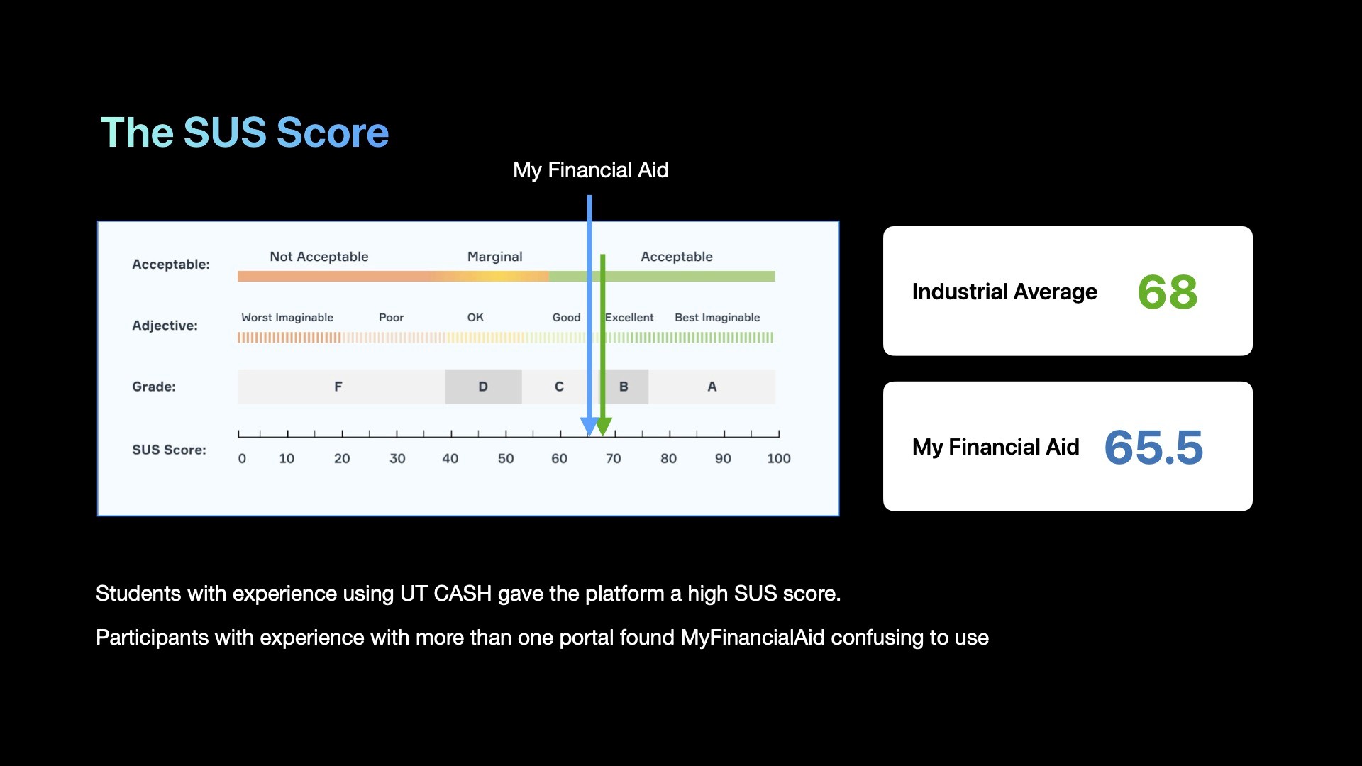
We calculated the System Usability Scale (SUS) scores to gauge the overall usability of the portal. The SUS is a reliable tool for measuring usability, providing a single score on a scale from 0 to 100.

  • Overall SUS Score: 52.5/100

  • Interpretation: A score below 68 is considered below average, indicating that there is significant room for improvement.

The majority of Likert scores across ten tasks were below 3.0, suggesting a moderate level of difficulty overall.Success Rate: 0%

  • Findings: The portal lacked visible contact and support information.

  • Design Recommendation: Add a footer with navigation and contact details, and create a dedicated support and FAQ page.

Recommendations

Recommendation

Recommendation

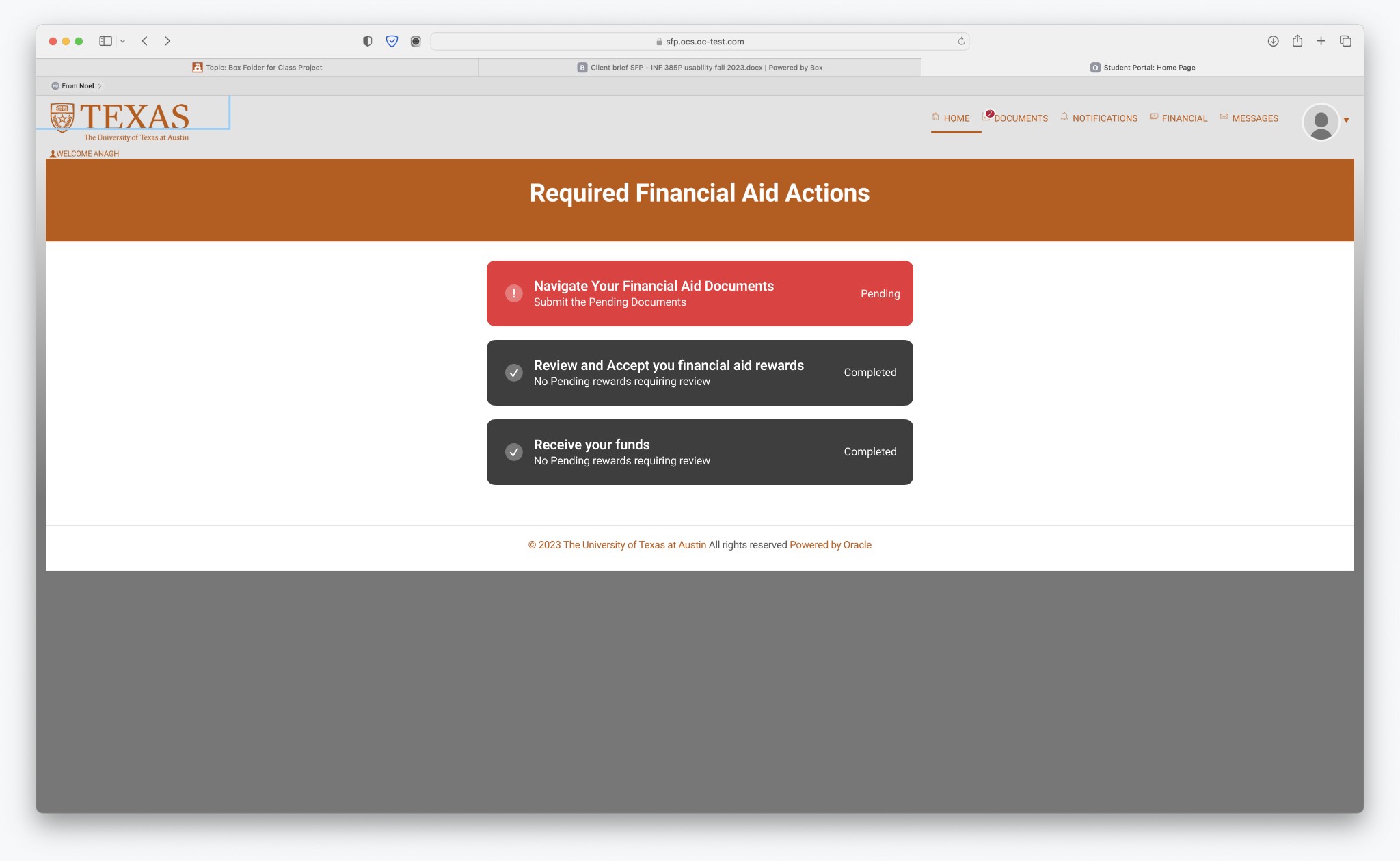
  1. Home Page Navigation: Ensure the UT logo directs users back to the Home page.

  2. Guided Walkthroughs: Introduce walkthroughs for first-time users.

  3. Footer Navigation: Include a comprehensive footer with navigation links and contact information.

  4. Clarifying Notifications & Messages: Merge notifications and messages to eliminate redundant information.

  5. Enhancing Header Visibility: Improve the visual design of headers to capture users' attention.
Learnings and Outcomes

Don’t Assume
Do not assume that users are familiar with the interface when giving tasks and asking for feedback.

Observe, Don’t Just Listen
Insights were gained from observing participants’ mouse movements, navigation, and pauses.

Users Blame Themselves
Most users assumed they did not interpret the interface correctly rather than blaming the interface.

Prior Knowledge
Knowledge of financial aid terminology made browsing the website easier and more fluid.

Conclusion

The transformation of the My Financial Aid Portal at UT Austin highlights the critical role of user-centered design in creating effective digital solutions. Our comprehensive usability study revealed significant insights into user behaviors and pain points, allowing us to implement targeted improvements. Key changes, such as enhanced navigation, more prominent action buttons, and a unified support section, directly addressed the issues faced by users.

The overall System Usability Scale (SUS) score of 52.5 indicates that while progress has been made, further refinements are needed. This project underscores the importance of continuous user feedback and iterative design to ensure the portal meets the evolving needs of its users.

By focusing on clarity, simplicity, and support, we have made the My Financial Aid Portal more accessible and user-friendly, ultimately helping students manage their financial aid more efficiently.

Testimonials

"I am incredibly impressed with the dedication and exceptional work. From the very beginning, their clear and concise context setting laid a strong foundation for the project. The team conducted a thorough usability study that highlighted critical user insights and pain points. Their recommendations were not only practical but also went above and beyond what was required, showcasing a deep understanding of the user's needs. The enhancements proposed, such as improved navigation and intuitive button placements, were both thoughtful and impactful.

The team's attention to detail was evident in their approach to both cosmetic and functional issues, such as correcting alignment problems and using appropriate color coding for status indicators. Their SWOT analysis of competitors was comprehensive and well-executed, although more specific recommendations would have been beneficial. Despite the complexities of including both students and parents in their study, the team managed to gather meaningful data and provide valuable insights. For future projects, I would recommend focusing on a single user group for more streamlined results. Overall, the UT Austin team has shown remarkable skill and dedication, making this project a prime example of how thoughtful design and research can significantly enhance user experience. Excellent job!"

user photo

Natalie Dare

Director UX Design, Whole Foods Market

Let’s work together

Always excited to team up with amazing individuals for interesting projects. Let's bring our ideas to life!

Let’s work together

Always excited to team up with amazing individuals for interesting projects. Let's bring our ideas to life!