/

Projects

/

LeadrPro Mobile

/

Projects

/

LeadrPro Mobile

/

Projects

/

LeadrPro Mobile

LeadrPro Mobile Redesign: Transforming Complexity into Clarity and Driving 40% More Demos

LeadrPro Mobile Redesign: Transforming Complexity into Clarity and Driving 40% More Demos

Impact at a Glance:

Impact at a Glance:

Impact at a Glance:

$29K
in Online Sales

$29K
in Online Sales

37%

More Demo Bookings

37%

More Demo Bookings

46%

fewer rescheduled demos

46%

fewer rescheduled demos

23%

more vendor profile views

23%

more vendor profile views

53%

increase in overall engagement

53%

increase in overall engagement

The Problem: What Users Needed but Weren’t Getting

What the Executive vendor had to say -

What the Executive vendor had to say -

" I’m putting thousands of dollars into the decision of vetting a business partner. I don’t just want to accept or reject. I need to explore my options. How can I judge with so little information? This isn’t a dating app! "

" I’m putting thousands of dollars into the decision of vetting a business partner. I don’t just want to accept or reject. I need to explore my options. How can I judge with so little information? This isn’t a dating app! "

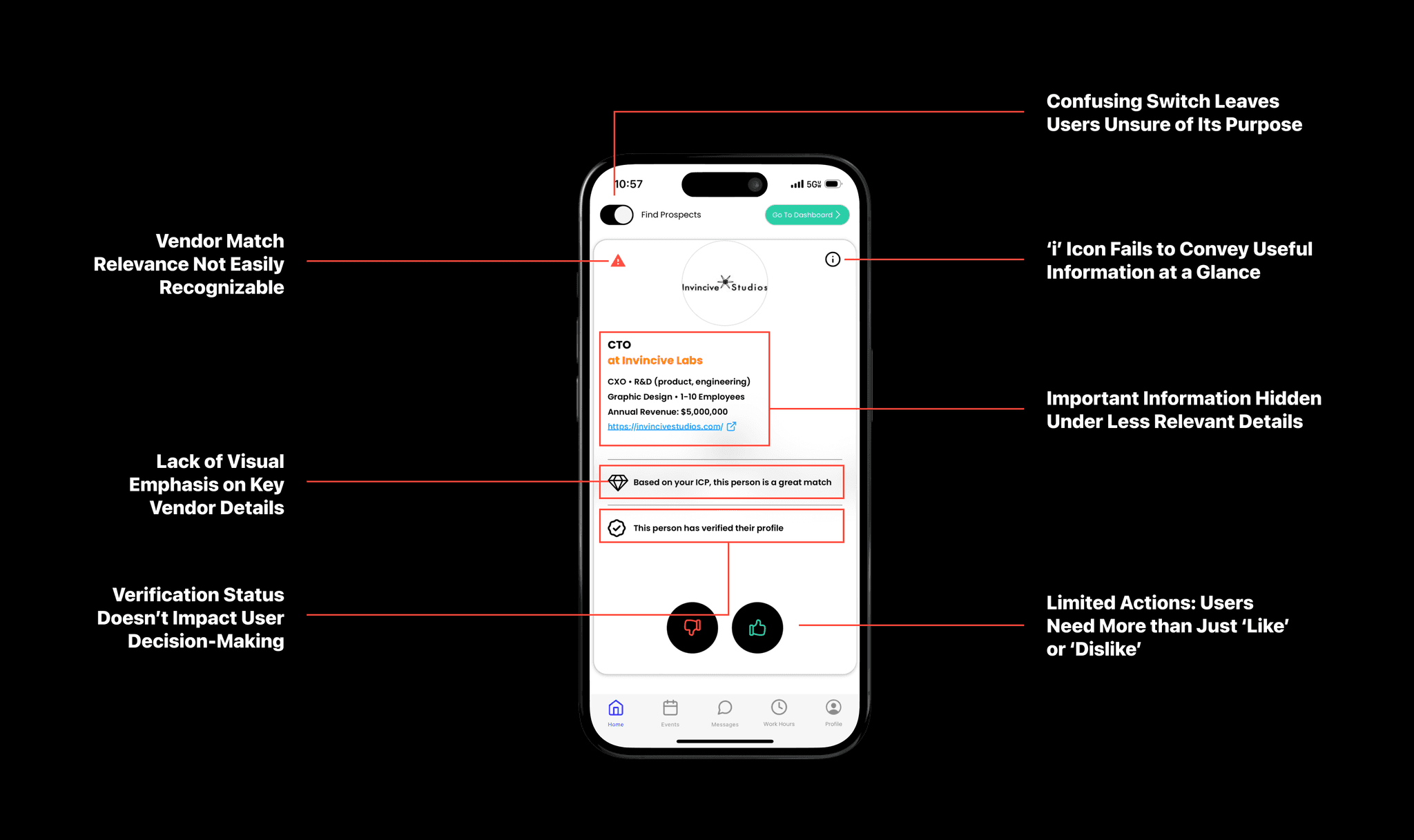
LeadrPro executives felt restricted by the swipe-based design, limited to ‘accept’ or ‘reject’ with only one vendor visible. They needed a more dynamic, exploratory experience for informed decision-making.

⚠️ Forced Binary Decisions

⚠️ Limited Vendor Details

⚠️ No Ability to Explore Multiple Options

⚠️ Lack of Control in Browsing

Pinpointing the Pain Points: What the Old Design Lacked

Pinpointing the Pain Points: What the Old Design Lacked

Pinpointing the Pain Points: What the Old Design Lacked

Stakeholder Buy In

Stakeholder Buy In

Stakeholder Buy In

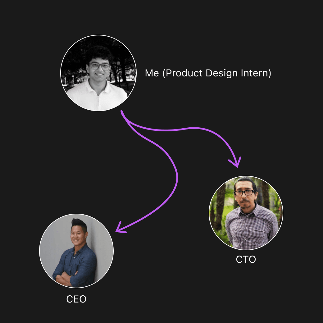
After analyzing the issues with the swipe-based design, I met with LeadrPro’s CEO and CTO to propose a hub-based system. The reasoning for this shift was clear:

Faster Access
Executives needed quick access to vendors, demos, and messages. A hub system cuts down on navigation steps.

Faster Access
Executives needed quick access to vendors, demos, and messages. A hub system cuts down on navigation steps.

Simplified Navigation
The swipe model was inefficient. Hubs provide a more intuitive, business-focused structure.

Simplified Navigation
The swipe model was inefficient. Hubs provide a more intuitive, business-focused structure.

Task Seperation
Each hub—vendors, demos, events—keeps tasks clear and organized.

Task Seperation
Each hub—vendors, demos, events—keeps tasks clear and organized.

Scalable Design
The hub layout allows new features to be added without cluttering the interface.

Scalable Design
The hub layout allows new features to be added without cluttering the interface.

The proposal gained approval, as both the CEO and CTO saw its potential to meet executive needs and drive engagement. This buy-in set the stage for the iterative design process that followed.

First Iteration: Introducing Vendor Profile Cards and Categories in the Hub

First Iteration: Introducing Vendor Profile Cards and Categories in the Hub

First Iteration: Introducing Vendor Profile Cards and Categories in the Hub

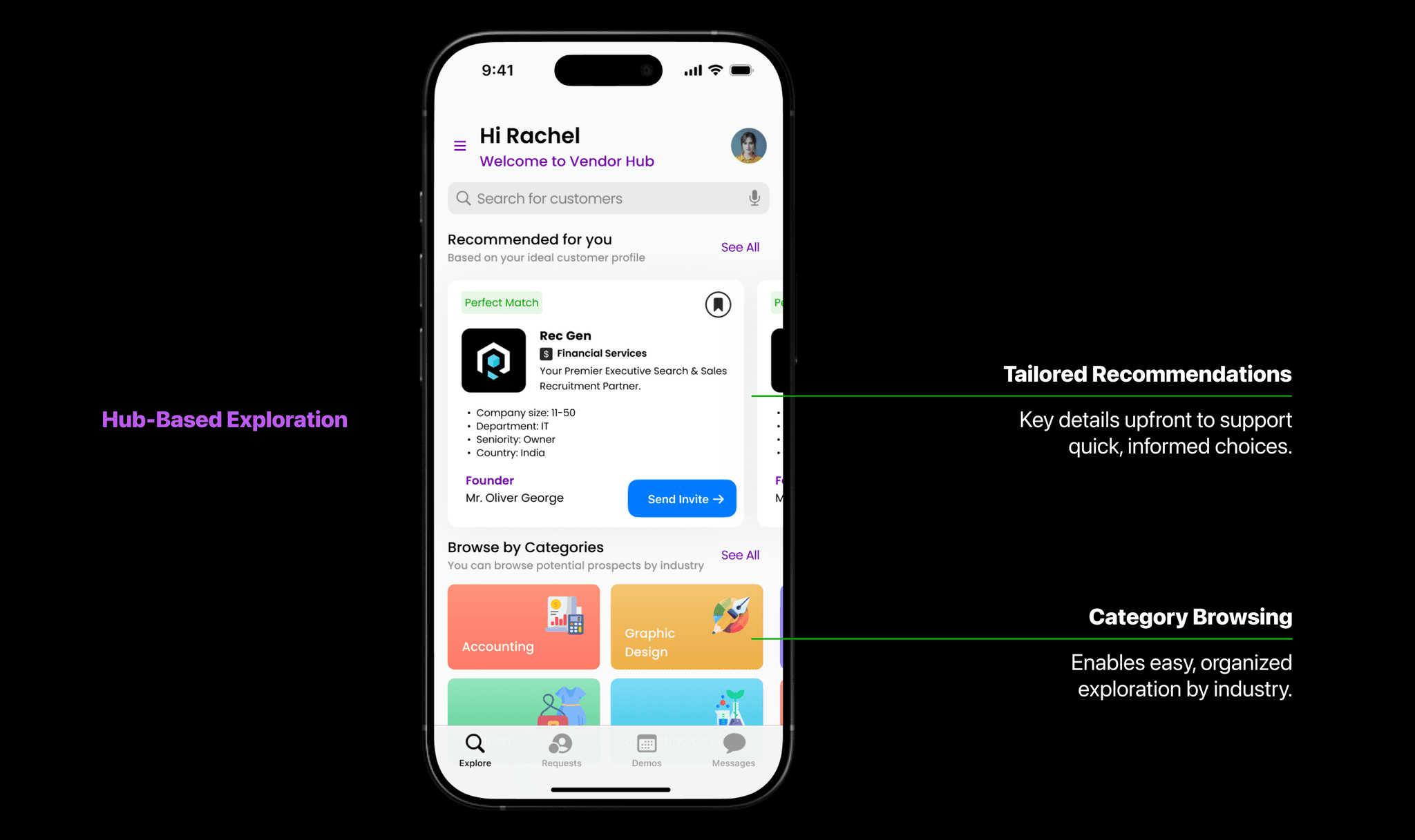
To break free from the restrictive swipe-based design, I proposed a hub layout centered on executive needs for depth and control. My approach focused on designing a way for users to navigate vendors intuitively—no more binary decisions, but instead, a curated journey through categorized options and tailored recommendations.

The Result

A 29% boost in profile views and 22% growth in vendor-related revenue
The Design Perspective

The Design Perspective

Simpler Navigation
The hub system made navigation clear and intuitive, giving users direct access to key functions like vendors and demos without confusion.

Simpler Navigation
The hub system made navigation clear and intuitive, giving users direct access to key functions like vendors and demos without confusion.

Reduced Cognitive Load
Each hub focused on a specific task, allowing users to stay focused without getting lost in irrelevant content.

Reduced Cognitive Load
Each hub focused on a specific task, allowing users to stay focused without getting lost in irrelevant content.

Task-Oriented Flow:
Separating tasks into hubs allowed smoother transitions between actions, aligning with user workflows.

Task-Oriented Flow:
Separating tasks into hubs allowed smoother transitions between actions, aligning with user workflows.

The Business Perspective

The Business Perspective

Boosted Engagement
Clear navigation led users to explore more of the platform, directly increasing demo bookings and engagement.

Boosted Engagement
Clear navigation led users to explore more of the platform, directly increasing demo bookings and engagement.

Better Vendor Exposure:
Vendors were more visible and easier to find, leading to more interactions and demo requests.

Better Vendor Exposure:
Vendors were more visible and easier to find, leading to more interactions and demo requests.

Scalability
The hub system allowed easy expansion as new features could be added without complicating the user experience

Scalability
The hub system allowed easy expansion as new features could be added without complicating the user experience

Vendor Hub: Clear, Actionable Profiles for Executives

Vendor Hub: Clear, Actionable Profiles for Executives

Vendor Hub: Clear, Actionable Profiles for Executives

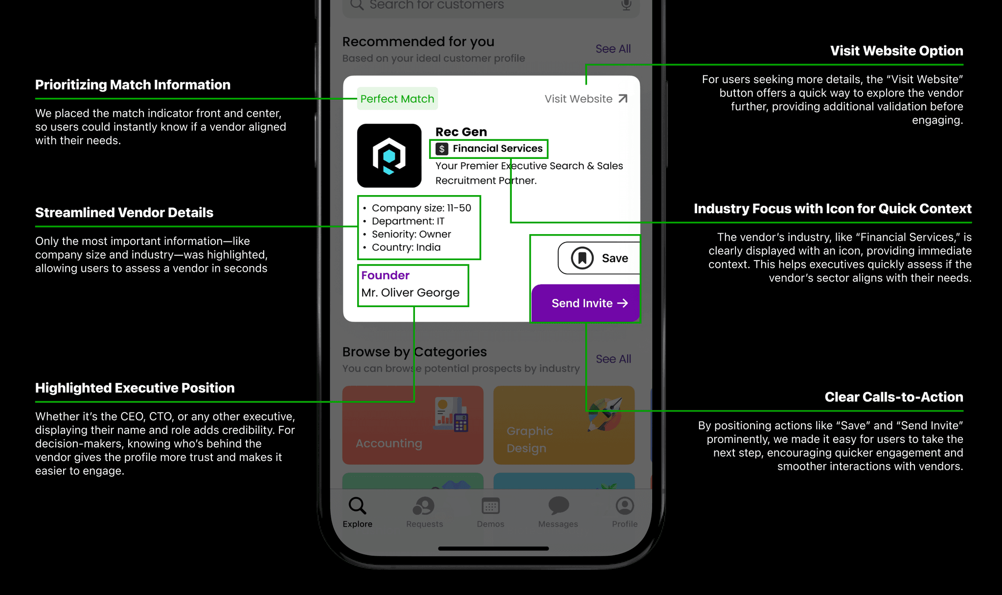
The Vendor Hub was redesigned to help executives quickly identify relevant vendors and take immediate action, reducing friction in their decision-making process.

Second Iteration: Streamlining Team Management Access

Second Iteration: Streamlining Team Management Access

Second Iteration: Streamlining Team Management Access

Initially, team management was somewhat hidden under the profile section. Users had to click on the profile icon, navigate through settings, and then access team management—a multi-step process. Usage data showed that 73% of users who clicked on the profile section went directly to team management, indicating it was a high-priority feature often buried in navigation.


Solution: To improve accessibility, I proposed moving team management to the homepage. We replaced the profile icon with a picture of the user’s profile and small icons of team members. Now, clicking on this section brings up an overlay with team settings directly, making the feature instantly accessible.

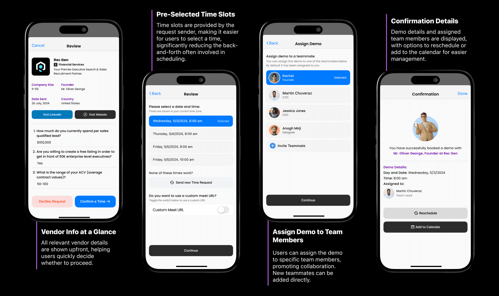
Less Time Scheduling, More Time Connecting - The Demo Booking Process

Less Time Scheduling, More Time Connecting - The Demo Booking Process

Less Time Scheduling, More Time Connecting - The Demo Booking Process

The demo scheduling process was reimagined to eliminate friction and enhance user efficiency and team collaboration. This redesign directly supports LeadrPro’s core objectives:

Increasing demo bookings

Reducing operational complexities across the platform

Reducing operational complexities across the platform

Streamlining user interactions

Yeah, We Made the Changes, But Did It Work?
The Answer……… Absolutely!

Yeah, We Made the Changes, But Did It Work?
The Answer……… Absolutely!

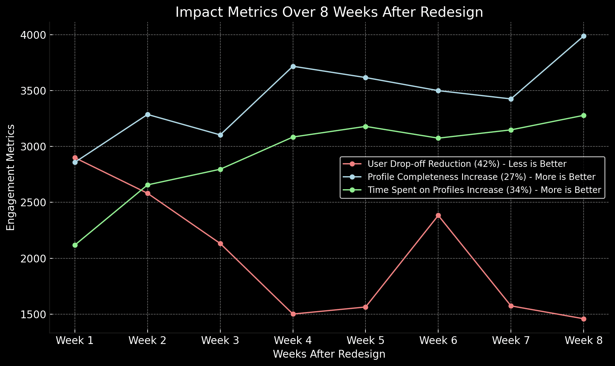
After implementing the hub-based system and improving core features, the platform saw significant improvements:

After implementing the hub-based system and improving core features, the platform saw significant improvements:

After implementing the hub-based system and improving core features, the platform saw significant improvements:

42%

User Drop Off Rate

27%

Profile Completeness

34%

Time Spent on Profiles

Bottom Navigation: A Clear Path to Business-Critical Actions

Bottom Navigation: A Clear Path to Business-Critical Actions

Bottom Navigation: A Clear Path to Business-Critical Actions

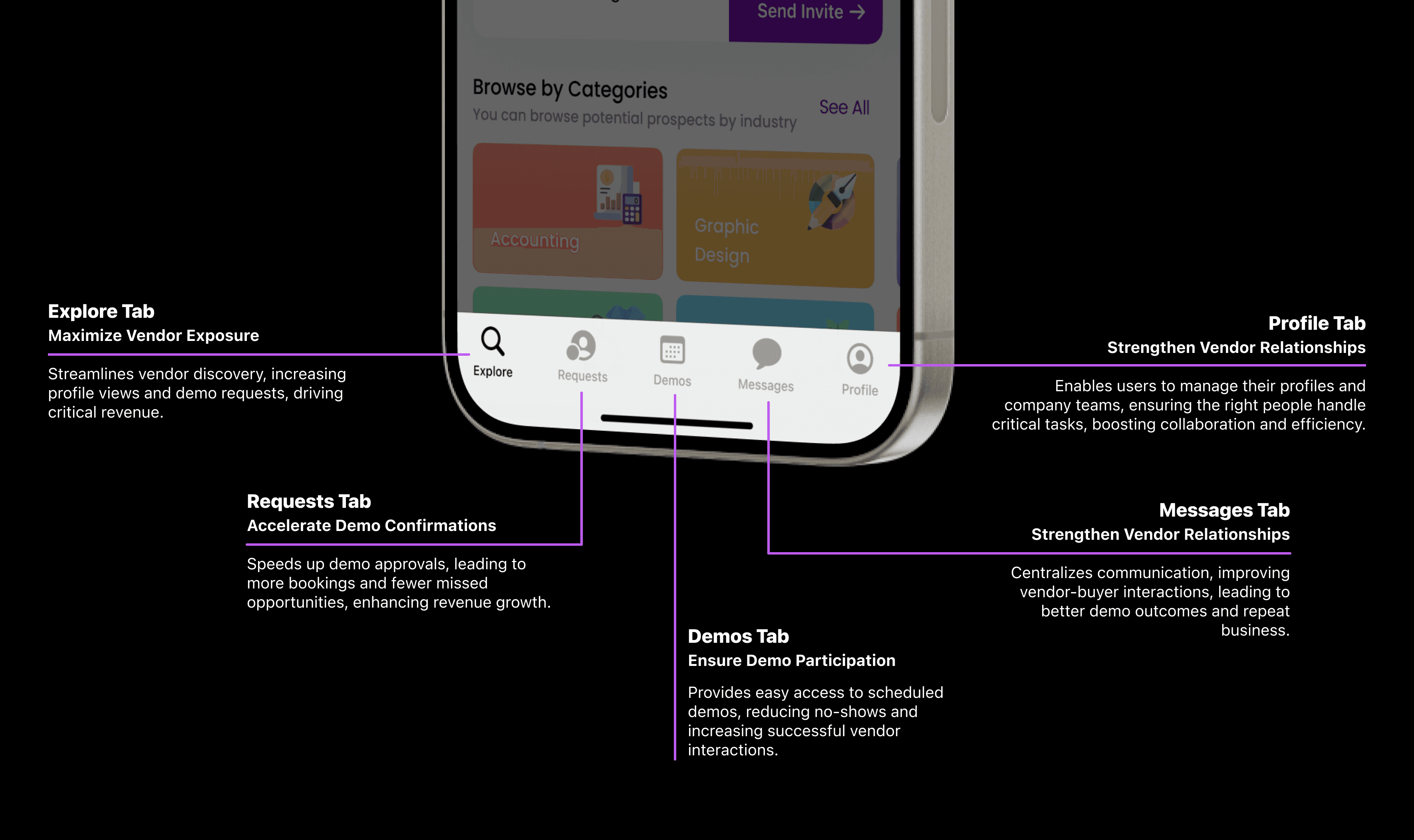
The features were carefully chosen to maximize user engagement and drive key business outcomes. Each tab focuses on reducing friction and ensuring users can quickly access actions that matter most, like demo bookings and vendor interactions.

How did the bottom navigation do?

How did the bottom navigation do?

How did the bottom navigation do?

33%

increase in vendor discovery interactions

26%

faster demo confirmation rates

12%

more timely demo attendance.

63%

higher communication engagement.

18%

increase in team management interactions.

🚨🚨 One Challenge: Event Misses Due to Lack of Cross-Hub Alerts!

While navigating between different hubs—such as the Software or Vendor Hub—users occasionally missed their scheduled events. This happened because there were no cross-hub notifications reminding them of upcoming events while they were focused on other tasks in different hubs.

The Solution: Cross-Hub Integration

The Solution: Cross-Hub Integration

To resolve this, we introduced cross-hub integration, ensuring that users are notified about their events, regardless of which hub they are currently using. This way, they can stay informed without missing any important engagements.

The Results: Real Business Impact

The Results: Real Business Impact

The Results: Real Business Impact

$42K
in Online Sales

$42K
in Online Sales

40%

More Demo Bookings

40%

More Demo Bookings

50%

fewer rescheduled demos

50%

fewer rescheduled demos

30%

more vendor profile views

30%

more vendor profile views

20%

increase in overall engagement

20%

increase in overall engagement

The impact of the redesign was clear:

The redesign boosted demo bookings, deepened vendor interactions, and increased user engagement. Cross-hub integration and streamlined navigation led to higher satisfaction, and most importantly, these changes drove $42K in online sales, reflecting real business growth.

What's Next? Phase 2!

What's Next? Phase 2!

What's Next? Phase 2!

  • Converting Event Attendees to Demo Bookings:
    Maximize Event Value
    Implement follow-up prompts and targeted incentives (e.g., exclusive offers) post-event to drive demo bookings, converting attendees into leads. This directly boosts revenue and leverages event participation for higher conversions.

  • Point System Integration:
    Increase Engagement with Rewards
    Expand the point system to reward actions like event attendance, demo bookings, and referrals. Tiered rewards incentivize repeat engagement, driving higher retention and more vendor interactions.

  • User Retention Tactics:
    Keep Users Active
    Use AI-driven recommendations and reminders for uncompleted actions (e.g., unbooked demos, incomplete profiles) to pull users back, ensuring higher retention and repeat engagement.